The Audit Office of NSW approached us to audit their visual assets and review the brand to determine whether it would be best to bring it up to date.
The Audit Office were keen to understand stakeholder thoughts around the brand and to also understand whether it represented the organisation in the best light.
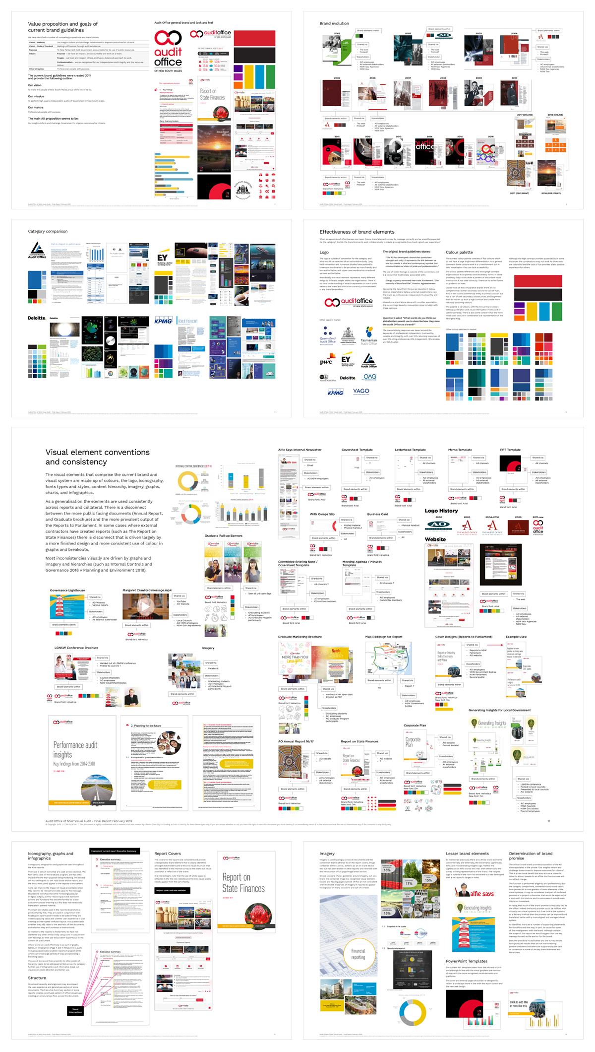
We began with looking at other state Audit Offices around Australia and abroad, as well as similar commercial institutions. This provided us a great benchmark and understanding of the industry.
We moved onto conducting a full audit of all the visual assets created and used by the Audit Office. We looked at everything from Reports to Parliament, usage of the logo, and how the brand has evolved over time.
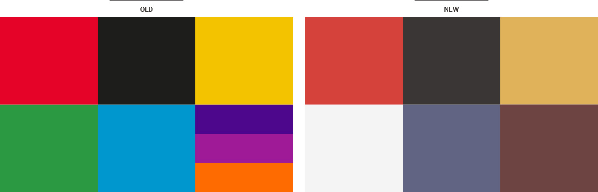
We found there were inconsistencies within the branding and the colour palette used was misaligned with industry expectations – both a good and bad thing.
We conducted surveys to gather feedback on how the brand is perceived and whether there was an appetite to rework the brand. It was also helpful to see where the brand wasn’t working, and how we could find a way to make it accessible to all stakeholders.
The culmination of all the data points we collected formed a final report to the Audit Office of NSW. This contained an overview of their brand, their colours, survey results as well as competitors and recommended next steps.
The Audit Office required a rebrand that would align them in a more modern frame, while also maintaining the signature red and logo shape that is very close to the staff of the Audit Office.
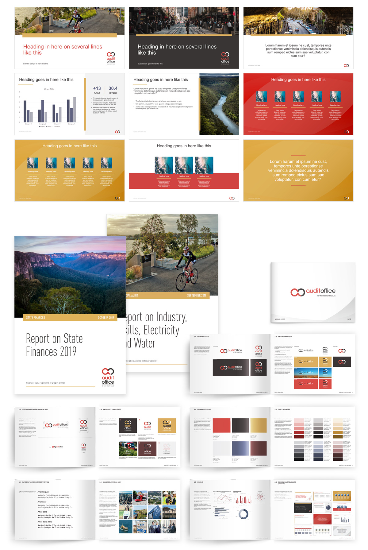
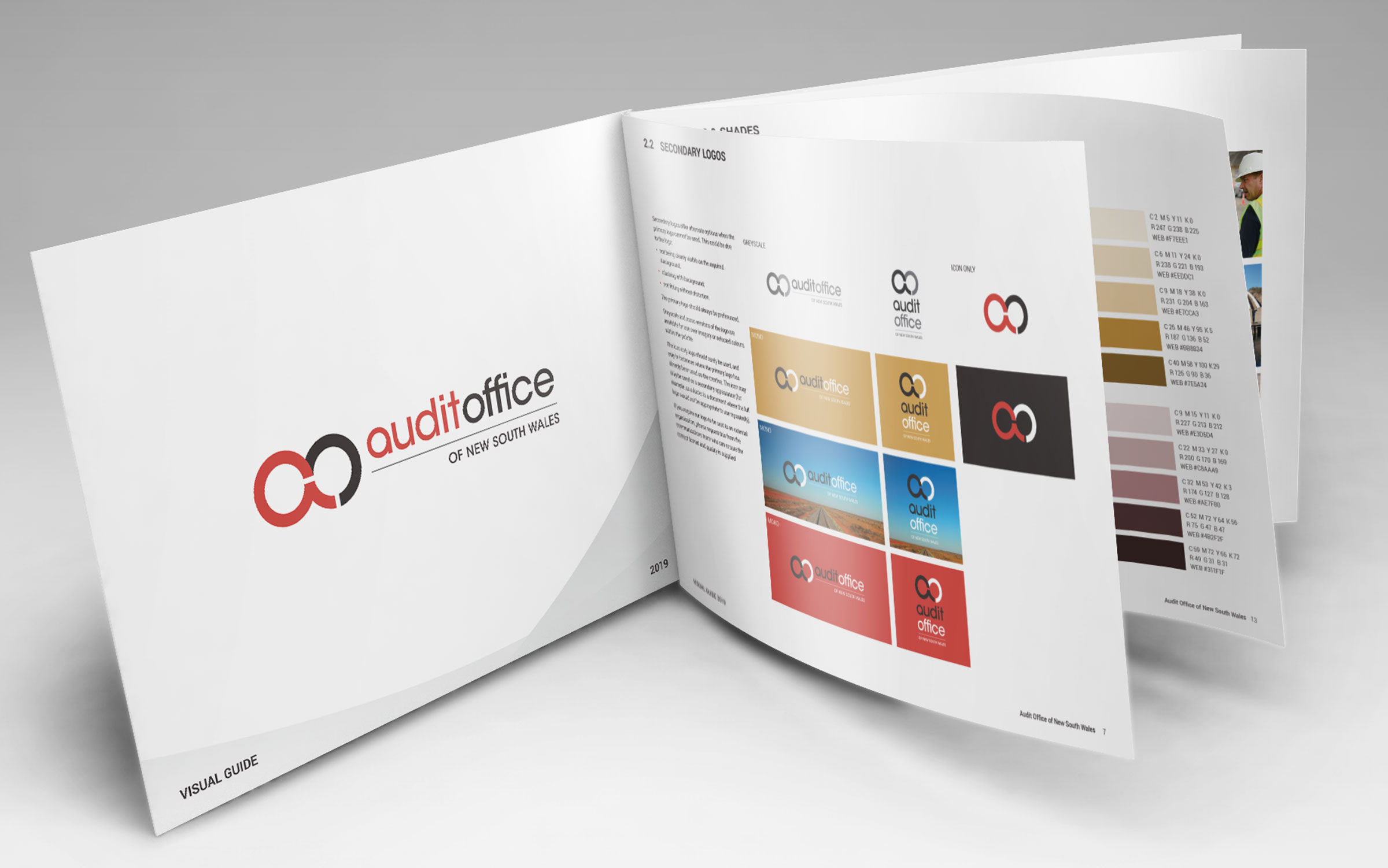
We created all new PowerPoint templates, Word templates as well as a visual guideline for the Audit Office brand that brought together the findings of the brand audit.
We were careful to consider accessibility in all aspects of the rebrand, from the colour choices to template designs, mono-coloured graphs and simple typography.
The visual guidelines also brought together the subtle changes we had brought to the brand which included a softer, more organic colour palette, image and text treatments.